动画#
1.transition 过渡动画#
1div {
2  width: 100px;
3  height: 100px;
4  background-color: red;
5  /* transition: transition-property, transition-duration,transition-timing-function,transition-delay; */
6  /* transition-property: all; */
7  /* 第一个监听属性 */
8  /* transition-property: width, height; */
9  /* transition-duration: ; */
10  /* 第二个时间间隔 */
11  /* transition-timing-function:linear ; */
12  /* 第三个运动状态 */
13  /* transition-delay: ; */
14  /* 第四个延迟 */
15  transition: width 2s linear 1s;
16  /* 总共3s,1s后开始宽度增加,增加2s */
17  /* 添加方式
18    前两个必须有,后两个默认
19    */
20}
21div:hover {
22  width: 200px;
23  height: 200px;
24}
动画 demo
1div {
2  position: absolute;
3  left: 0;
4  top: 0;
5  opacity: 0.5;
6  width: 100px;
7  height: 100px;
8  background-color: red;
9  transition: all 2s;
10}
11
12div:hover {
13  opacity: 1;
14  top: 100px;
15  left: 100px;
16  height: 200px;
17  width: 200px;
18}2.cubic-bezier#
1div {
2  width: 100px;
3  height: 50px;
4  border: 1px solid red;
5  border-radius: 10px;
6  transition: all 1s cubic-bezier(0.5, -1.5, 0.8, 2); /*代表两个坐标点
7    	x:(0,1)
8    	y:都可
9    */
10}
11div:hover {
12  width: 300px;
13}3.animation#
1@keyframes run {
2  0% {
3    /* 0%相当于from */
4    left: 0;
5    top: 0;
6    /* background-color: red; */
7  }
8  25% {
9    left: 100px;
10    top: 0;
11    /* background-color: green; */
12  }
13  50% {
14    left: 100px;
15    top: 100px;
16    /* background-color: blue; */
17  }
18  75% {
19    left: 0;
20    top: 100px;
21    /* background-color: coral; */
22  }
23  100% {
24    /* 100%相当于to  */
25    left: 0;
26    top: 0;
27  }
28}
29@keyframes color-change {
30  0% {
31    background-color: red;
32  }
33  60% {
34    background-color: blue;
35  }
36  100% {
37    background-color: black;
38  }
39}
40div {
41  position: relative;
42  width: 100px;
43  height: 100px;
44  background-color: red;
45  /* animation: run 4s; */
46  /* animation: run 4s, color-change 4s;两个动画同时运行 */
47  /* animation: run 4s cubic-bezier(.5,1,1,1);其实是是每一段的运动状态 */
48  /* animation: run 4s cubic-bezier(.5, 1, 1, 1) 1s;延迟1s执行动画 */
49  /* animation: run 4s cubic-bezier(.5, 1, 1, 1) 1s 2; 执行2次动画 */
50  /* animation: run 4s cubic-bezier(.5, 1, 1, 1) 1s infinite; 死循环 */
51  /* animation: run 4s cubic-bezier(.5, 1, 1, 1) 1s reverse;倒着走 */
52  /* animation: run 4s cubic-bezier(.5, 1, 1, 1) 1s 2 alternate;先证者走,在倒着走,意味着次数>=2(单摆) */
53}
animation-fill-mode:
forwards: 设置对象状态为动画结束时候的状态
backwards:设置对象状态为动画开始时候第一针的状态
both:设置对象状态为动画结束和开始的状态的综合体
太阳月亮 demo——文件夹
4.step 跳转动画#
1@keyframes change-color {
2  0% {
3    background-color: red;
4  }
5
6  25% {
7    background-color: green;
8  }
9
10  50% {
11    background-color: blue;
12  }
13
14  75% {
15    background-color: black;
16  }
17
18  100% {
19    background-color: #fff;
20  }
21}
22div {
23  width: 100px;
24  height: 100px;
25  background-color: rgb(247, 20, 247);
26  /* animation: change-color 4s steps(1, end); */
27  /* 不过度 一步到位 */
28  /* animation: change-color 4s steps(2, end); */
29  /* 每一段用2步实现,动画更加细腻了 */
30  /* animation: change-color 4s steps(1, start); */
31  /* start与end
32    	end保留当前帧状态,直到这个动画时间结束    忽略最后一针
33    	start保留下一针状态,直到这段动画时间结束   忽略第一针
34    */
35  /* 要想弥补时间段   想看见最后一针
36    	animation: change-color 4s steps(1, end) forwards;
37    */
38}
区别 end 与 start
1<!DOCTYPE html>
2<html lang="en">
3  <head>
4    <meta charset="UTF-8" />
5    <meta name="viewport" content="width=device-width, initial-scale=1.0" />
6    <title>Document</title>
7    <style>
8      * {
9        padding: 0;
10        margin: 0;
11      }
12
13      @keyframes run {
14        0% {
15          left: 0;
16        }
17
18        25% {
19          left: 100px;
20        }
21
22        50% {
23          left: 200px;
24        }
25
26        75% {
27          left: 300px;
28        }
29
30        100% {
31          left: 400px;
32        }
33      }
34
35      .demo1,
36      .demo2 {
37        position: absolute;
38        left: 0;
39        background-color: black;
40        width: 100px;
41        height: 100px;
42        color: #fff;
43      }
44
45      .demo1 {
46        animation: run 4s steps(1, start);
47      }
48
49      .demo2 {
50        top: 100px;
51        /* animation: run 4s steps(1, end); */
52        animation: run 4s steps(1, end) forwards;
53      }
54
55      /*
56            steps(1,end);===step-end
57            steps(1,start);===step-start
58            */
59    </style>
60  </head>
61
62  <body>
63    <div class="demo1">start</div>
64    <div class="demo2">end</div>
65  </body>
66</html>
打字效果
1<!DOCTYPE html>
2<html lang="en">
3  <head>
4    <meta charset="UTF-8" />
5    <meta name="viewport" content="width=device-width, initial-scale=1.0" />
6    <title>Document</title>
7    <style>
8      * {
9        padding: 0;
10        margin: 0;
11      }
12
13      @keyframes cursor {
14        0% {
15          border-left-color: rgba(0, 0, 0, 0);
16        }
17
18        50% {
19          border-left-color: rgba(0, 0, 0, 1);
20        }
21
22        100% {
23          border-left-color: rgba(0, 0, 0, 0);
24        }
25      }
26
27      @keyframes cover {
28        0% {
29          left: 0;
30        }
31
32        100% {
33          left: 100%;
34        }
35      }
36
37      div {
38        position: relative;
39        display: inline-block;
40        height: 100px;
41        /* background-color: red; */
42        font-size: 80px;
43        line-height: 100px;
44        font-family: monospace;
45      }
46
47      div::after {
48        content: "";
49        position: absolute;
50        left: 0;
51        top: 10px;
52        height: 90px;
53        width: 100%;
54        background-color: #fff;
55        border-left: 2px solid black;
56        box-sizing: border-box;
57        animation: cursor 1s steps(1, end) infinite, cover 12s steps(12, end);
58      }
59    </style>
60  </head>
61
62  <body>
63    <div>sdknajnakjna</div>
64  </body>
65</html>
表盘效果——文件夹
跑马效果
1<!DOCTYPE html>
2<html lang="en">
3  <head>
4    <meta charset="UTF-8" />
5    <meta name="viewport" content="width=device-width, initial-scale=1.0" />
6    <title>Document</title>
7    <style>
8      * {
9        padding: 0;
10        margin: 0;
11      }
12      @keyframes run {
13        0% {
14          background-position: 0 0;
15        }
16
17        100% {
18          background-position: -2400px 0;
19        }
20      }
21      div {
22        width: 200px;
23        height: 100px;
24        background-image: url(./web/horse.png);
25        background-repeat: no-repeat;
26        background-position: 0 0;
27        animation: run 0.3s steps(12, end) infinite;
28      }
29    </style>
30  </head>
31
32  <body>
33    <div class="horse"></div>
34  </body>
35</html>
5.rotate3D 变换#
rotate:2d 变换
rotateX,rotateY,rotateZ:3d 变换
旋转
1@keyframes round {
2  0% {
3    transform: rotate(0deg);
4  }
5
6  100% {
7    transform: rotate(360deg);
8  }
9}
10
11div {
12  position: absolute;
13  left: 200px;
14  top: 200px;
15  width: 200px;
16  height: 200px;
17  background-image: url(./source/pic6.jpeg);
18  background-size: cover;
19  transform: rotate(0deg);
20  /* transform-origin: center center; */
21  /* 圆心给谁设置,参考的就是谁 */
22  transform-origin: 0 0;
23  animation: round 2s infinite;
24}
3D 变换
1body {
2  perspective: 800px;
3  transform-style: preserve-3d;
4  perspective-origin: 300px 300px;
5}
6
7div {
8  position: absolute;
9  left: 200px;
10  top: 200px;
11  width: 200px;
12  height: 200px;
13  background-image: url(./source/pic6.jpeg);
14  background-size: cover;
15  transform-origin: 0 0;
16  /* transform: rotateX(0deg); */
17  /* transform: rotateX(0deg) rotateY(0deg); */
18  /* 旋转顺序不同,结果不同 */
19}
rotate3d()
transform: rotate3d(x, y, z, angle); 矢量和作为旋转轴
小练习图片钟摆效果
1body {
2  perspective: 800px;
3  transform-style: preserve-3d;
4  perspective-origin: 300px 300px;
5}
6
7@keyframes change {
8  0% {
9    transform: rotateX(-45deg) rotateY(90deg);
10  }
11
12  100% {
13    transform: rotateX(45deg) rotateY(90deg);
14  }
15}
16
17div {
18  position: absolute;
19  left: 200px;
20  top: 200px;
21  width: 200px;
22  height: 200px;
23  background-image: url(./source/pic6.jpeg);
24  background-size: cover;
25  transform-origin: 0 0;
26  animation: change 2s cubic-bezier(0.5, 0, 0.5, 1) infinite alternate;
27}
6.scale 伸缩#
1/* transform: scale(1, 2); 2d x,y轴*/
2/*
3    transform: scaleX();
4    transform: scaleY();
5    transform: scalez();
6    transform: scale3d();  就是叠加
7*/
8/* scale:
9    1.伸缩元素变化坐标轴的刻度 ,translateX,Y验证。伸缩之后,translateX(100)产生的效果是200
10    2.设置两次,则第二次在第一次基础上叠加
11    3.旋转伸缩在一个轴进行
12		4.雁过留声  伸缩过的影响一直保留
13*/
14/* transform: scale() rotate();位置讲究  先后scale不一样*/
7.skew 倾斜#
skew(x, y);
skewx();
skewy();
demo
1body {
2  perspective: 800px;
3  transform-style: preserve-3d;
4  perspective-origin: 300px 300px;
5}
6
7@keyframes skewchange {
8  0% {
9    transform: skew(45deg, 45deg);
10  }
11
12  50% {
13    transform: skew(0, 0);
14  }
15
16  100% {
17    transform: skew(-45deg, -45deg);
18  }
19}
20
21div {
22  position: absolute;
23  left: 200px;
24  top: 200px;
25  width: 200px;
26  height: 200px;
27  background-image: url(./source/pic6.jpeg);
28  background-size: cover;
29  transform-origin: center center;
30  /* transform: skew(0deg, 0deg); */
31  /* 倾斜的不是元素本身,而是坐标轴
32    坐标轴倾斜,刻度被拉伸 */
33  /*
34        skew(x,y);
35        skewx()
36        skewy()
37    */
38  animation: skewchange 4s cubic-bezier(0, 0, 1, 1) infinite alternate;
39}8.translate+perspective#
2d translate(x, y) translatex() translatey() translatex() translate3d()
1/* transform: translate(100px); */
2/* transform: translate3d(100px, 100px 100px); */
3
4/*
5	transform: translatex()
6	translatez()
7*/
8transform: rotatey(90deg) translatez(100px);
9transform: translatez(100px) rotatey(90deg);
小应用:calc(50% - 0.5*宽高),不知道宽高:
1left: 50%;
2transform: translatex(-50%) 半个身位;
关于 translatez()
1body {
2  perspective: 800px;
3}
4div {
5  position: absolute;
6  left: 200px;
7  top: 200px;
8  width: 200px;
9  height: 200px;
10  background-image: url(demo/u.png);
11  background-size: cover;
12  /*transform: translatez(100px) rotatey(90deg);*/
13  /*z没起作用?旋转晚了*/
14  transform: rotatey(90deg) translatez(100px);
15}
demo
1<!DOCTYPE html>
2<html lang="en">
3  <head>
4    <meta charset="UTF-8" />
5    <meta name="viewport" content="width=device-width, initial-scale=1.0" />
6    <title>Document</title>
7    <style>
8      * {
9        padding: 0;
10        margin: 0;
11      }
12
13      :root {
14        height: 100%;
15      }
16
17      body {
18        perspective: 800px;
19        height: 100%; //需要有高度才能实现鼠标移动到哪里都能触发事件
20      }
21
22      .content1,
23      .content2,
24      .content3,
25      .content4,
26      .content5 {
27        width: 200px;
28        height: 200px;
29        background-image: url(./source/pic3.jpeg);
30        background-size: cover;
31        position: absolute;
32        top: 200px;
33        transform: rotateY(45deg);
34      }
35
36      .content1 {
37        left: 200px;
38      }
39
40      .content2 {
41        left: 400px;
42      }
43
44      .content3 {
45        left: 600px;
46      }
47
48      .content4 {
49        left: 800px;
50      }
51
52      .content5 {
53        left: 1000px;
54      }
55    </style>
56  </head>
57
58  <body>
59    <div class="content1"></div>
60    <div class="content2"></div>
61    <div class="content3"></div>
62    <div class="content4"></div>
63    <div class="content5"></div>
64    <script>
65      document.body.onmousemove = function (e) {
66        this.style.perspectiveOrigin = "" + e.pageX + "px " + e.pageY + "px";
67      };
68    </script>
69  </body>
70</html>
与 perspective 类似的一个东西: transform: perspective(800px) rotateY(45deg); 写在前面并且元素本身,眼睛就在 center 不能调 perspective 在父级才有效 景深可以叠加 深入理解 perspevtive
1body {
2  perspective: 800px; /*移动眼睛*/
3  perspective-origin: 300px 300px;
4}
5div {
6  position: absolute;
7  left: 200px;
8  top: 200px;
9  width: 200px;
10  height: 200px;
11  background-image: url(demo/u.png);
12  background-size: cover;
13  /*移动物体*/
14  /*transform: translatez(100px);*/
15  /*快接近800就见不到了,快后脑勺了*/
16  transform: translatez(100px);
17}
深入理解 perspective
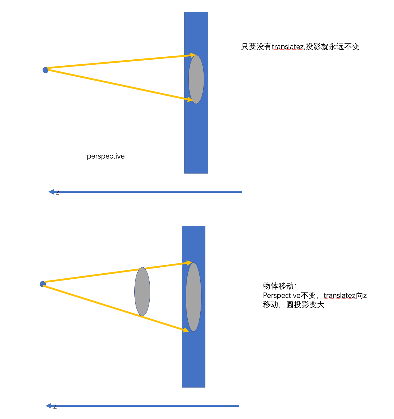
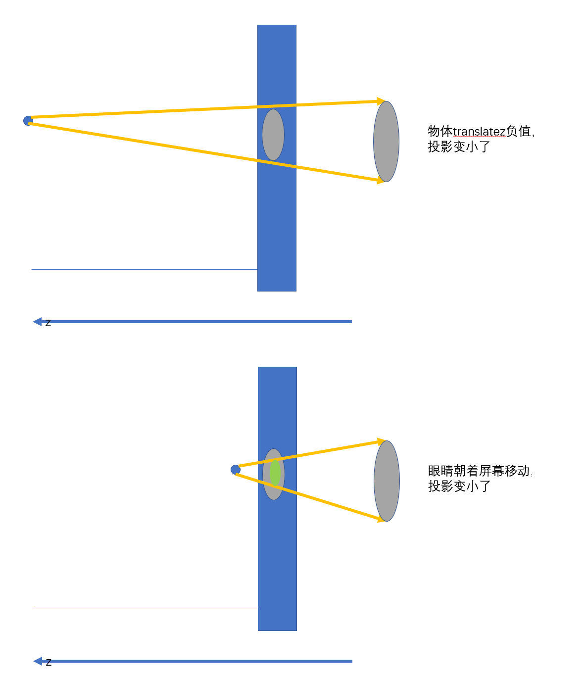
transform-style
1<!DOCTYPE html>
2<html lang="en">
3  <head>
4    <meta charset="UTF-8" />
5    <meta name="viewport" content="width=device-width, initial-scale=1.0" />
6    <title>Document</title>
7    <style>
8      * {
9        padding: 0;
10        margin: 0;
11      }
12
13      body {
14        perspective: 800px;
15        perspective-origin: 300px 100px;
16      }
17
18      .wrapper {
19        position: absolute;
20        left: 200px;
21        top: 200px;
22        width: 200px;
23        height: 200px;
24        background-color: red;
25        transform: rotateY(0deg);
26        /*父级旋转会带儿子旋转,因为浏览器渲染不了,所以z轴体现不出来,想立体,给父级(不能祖父)加上transform-style: preserve-3d;*/
27      }
28
29      .demo {
30        width: 200px;
31        height: 200px;
32        background-image: url(demo/u.png);
33        background-size: cover;
34        transform: translateZ(100px);
35      }
36    </style>
37  </head>
38
39  <body>
40    <div class="wrapper">
41      <div class="demo"></div>
42    </div>
43  </body>
44</html>
transform-origin
1<!DOCTYPE html>
2<html lang="en">
3  <head>
4    <meta charset="UTF-8" />
5    <meta name="viewport" content="width=device-width, initial-scale=1.0" />
6    <title>Document</title>
7    <style>
8      * {
9        padding: 0;
10        margin: 0;
11      }
12
13      body {
14        perspective: 800px;
15        perspective-origin: 300px 100px;
16        transform-style: preserve-3d;
17      }
18
19      @keyframes move {
20        0% {
21          transform: rotateY(0deg);
22        }
23        100% {
24          transform: rotateY(360deg);
25        }
26      }
27      div {
28        position: absolute;
29        left: 200px;
30        top: 200px;
31        width: 200px;
32        height: 200px;
33        background-image: url(demo/u.png);
34        background-size: cover;
35        animation: move 2s linear infinite;
36        transform-origin: 100px 100px 100px;
37        /* 可以设置空间点中心旋转 */
38      }
39    </style>
40  </head>
41
42  <body>
43    <div></div>
44  </body>
45</html>
照片墙
1<!DOCTYPE html>
2<html lang="en">
3  <head>
4    <meta charset="UTF-8" />
5    <meta name="viewport" content="width=device-width, initial-scale=1.0" />
6    <title>Document</title>
7    <style>
8      * {
9        padding: 0;
10        margin: 0;
11      }
12
13      :root,
14      body {
15        height: 100%;
16      }
17
18      body {
19        perspective: 3000px;
20        transform-style: preserve-3d;
21        /* 一旦设置了这两个属性当中一条,他就变成了定位的参照物元素,所以这里没高度的话就导致没高度了 */
22      }
23
24      @keyframes round {
25        /*让父级转    简单*/
26        0% {
27          transform: translate(-50%, -50%) rotateY(0deg);
28        }
29
30        100% {
31          transform: translate(-50%, -50%) rotateY(360deg);
32        }
33      }
34
35      div.wrapper {
36        position: absolute;
37        left: calc(50%);
38        top: calc(50%);
39        /* 写了top没生效的重要原因:父级没有高度,因为body,解决就把body上面 height打开 */
40        width: 300px;
41        height: 300px;
42        transform: translate(-50%, -50%);
43        transform-style: preserve-3d;
44        animation: round 5s linear infinite;
45      }
46
47      img {
48        position: absolute;
49        width: 300px;
50        /* backface-visibility: hidden; */
51        /* 图片背部 */
52      }
53
54      img:nth-of-type(1) {
55        transform: rotateY(45deg) translatez(800px);
56        /*沿着自己的z轴向外拓*/
57      }
58
59      img:nth-of-type(2) {
60        transform: rotateY(90deg) translatez(500px);
61        /* 可以改变y值,实现层叠 */
62      }
63
64      img:nth-of-type(3) {
65        transform: rotateY(135deg) translatez(500px);
66      }
67
68      img:nth-of-type(4) {
69        transform: rotateY(180deg) translatez(500px);
70      }
71
72      img:nth-of-type(5) {
73        transform: rotateY(225deg) translatez(500px);
74      }
75
76      img:nth-of-type(6) {
77        transform: rotateY(270deg) translatez(500px);
78      }
79
80      img:nth-of-type(7) {
81        transform: rotateY(315deg) translatez(500px);
82      }
83
84      img:nth-of-type(8) {
85        transform: rotateY(360deg) translatez(500px);
86      }
87    </style>
88  </head>
89
90  <body>
91    <div class="wrapper">
92      <img src="demo/u.png" alt="" />
93      <img src="demo/u.png" alt="" />
94      <img src="demo/u.png" alt="" />
95      <img src="demo/u.png" alt="" />
96      <img src="demo/u.png" alt="" />
97      <img src="demo/u.png" alt="" />
98      <img src="demo/u.png" alt="" />
99      <img src="demo/u.png" alt="" />
100    </div>
101    <script>
102      document.body.onmousemove = function (e) {
103        this.style.perspectiveOrigin = "" + e.pageX + "px " + e.pageY + "px";
104      };
105    </script>
106  </body>
107</html>
作业:3D 魔方 知识点是一样的
9.matrix#
矩阵就是 transform 给咱们选中的计算规则 矩阵函数传的参数是矩阵的前两行
1平移// translate
2| 1 0 e|			|x|			|x + e|
3| 0 1 f|   *  |y| =   |y + f|
4| 0 0 1|  		|z|			|1    |
5matrix(1,0,0,1,e,f); === translate(x, y);
6// scale
7| a,0,0 |     | x |      | ax |
8| 0,d,0 |  *  | y |   =  | dy |
9| 0,0,1 |     | 1 |      | 1  |
10matrix(a,0,0,d,0,0); === scale(x, y);
11// rotate
12matrix(cos(θ),sin(θ),-sin(θ),cos(θ),0,0); === rotate(θ);
13| cos(θ),-sin(θ),e |     | x |
14| sin(θ),cos(θ) ,f |  *  | y |
15| 0     ,0      ,1 |     | 1 |
16x1 = cos(θ)x - sin(θ)y + 0
17y2 = sin(θ)x + cos(θ)y + 0
18matrix(1,tan(θy),tan(θx),1,0,0)
19
20
21matrix(1,0,0,0,0,1,0,0,0,0,1,0,x,y,z,1) 缩放
22matrix(x,0,0,0,0,y,0,0,0,0,z,0,0,0,0,1) 平移
利用矩阵实现镜像:核心是符号取反
1div{
2    width:200px;
3    height:200px;
4    background-image:url(source/pic3.jpeg);
5    background-size: cover;
6    transform:matrix(-1,0,0,1,0,0);
7}
8|-1,0, 0 |     	| x |      | -x |  x取反,反推第一个矩阵表达式
9| 0, 1, 0 |  *  | y |   =  | -y |
10| 0, 0, 1 |     | 1 |      | 1  |
浏览器渲染过程:
1download html download css download js css rules tree(construct) domAPI domTree
2cssrulestree cssomAPI 最终cssomTree domtree cssomTree renderTree | | layout布局
3---- > paint喷色 (reflow重构) (repaint) 逻辑图(多层矢量图) ----->
4实际绘制(栅格化) 不设置就用cpu绘制 google chrome 自动调用 gpu目录